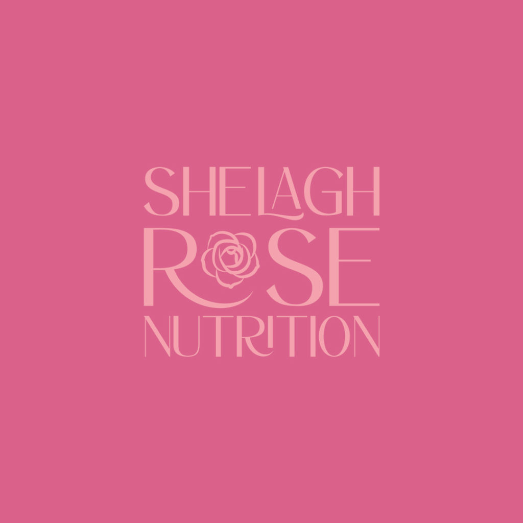
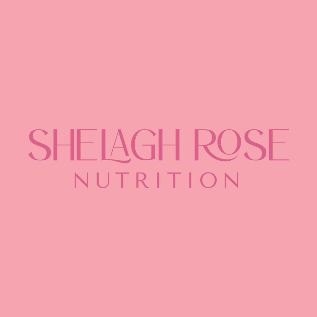
Imagine a brand that is bright, colorful, fun with a side of roses… insert Shelagh Rose Nutrition’s branding and you’d be happy to find those results!
Shelagh is a Women’s PCOS Dietitian based out of Boston, Massachusetts. Her personality is SO bubbly – it’s hard not to want to talk hours with her. As we dove into her brand strategy, we discovered she wanted her clients to feel optimistic, intrigued and hopeful when interacting with her brand. As a designer, I really liked her choice of words as not many other clients have said them before; immediately after reading, we felt that bright colors represented this feeling SO accurately.
Alongside targeting women who have PCOS, we felt pink was a great main color – it represents hope, opportunity, and feminism at the same time. She also described that she really liked the color of the sunset, which was definitely doable with the audience she was targeting!
One of my favorite takeaways from Shelagh’s project was her answer to one of our questions:
Her answer: Not anything that I love but I do know that I hate comic sans! As a creative, comic sans is always a no, so I loved that Shelagh was definitely on board with that – it made us smile!

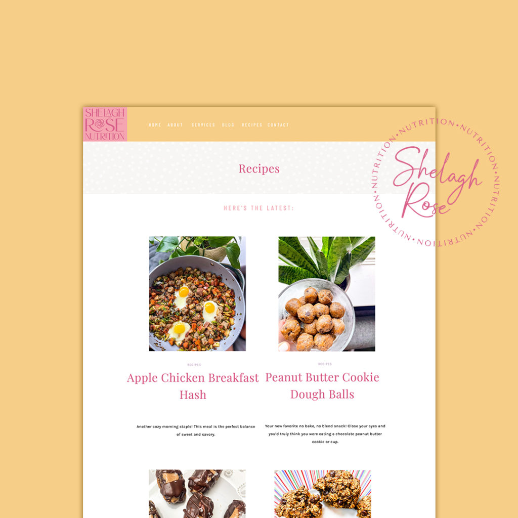
We built her dietitian website on the Showit platform because blogging wasn’t her *main* objective in business and Showit makes it easy for anyone to learn website design!
As most of our other nutritionist projects, we created a recipes page and a blog page separately. Aside from that, we built out a home, about, services and contact page. It’s SO fun, right?!
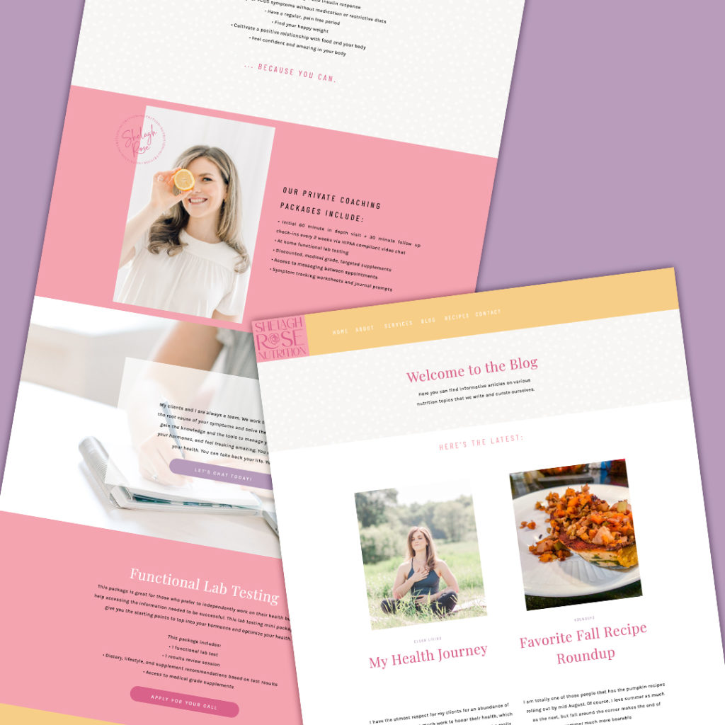
You can checkout Shelagh’s live website here – if you want a website for your new private practice, book a discovery call with me – we are booking for February and only have two spots left!