Hey there friend – happy Friday (or whatever day you are reading this on)! This week, a certain topic regarding websites was brought up to me that I decided needed a little more space on my blog for.
Accessibility.
During my sophomore year in college, I was able to intern for a Technical Writer at NC State University who wrote manuals, guides, and all the “techy” language for the professionals within the University. A big part of her job was writing [and including] content that was accessible for those with visual disabilities. She really taught me all I needed to know about making a website accessible.
This week I have been working on a WordPress website for a therapist located in New York. We are doing a complete overhaul of her website and one of the things she brought to my attention was this:
“Some of my clients deal with visual disabilities. One of them actually told me that she couldn’t even interact or read with my [old] website because it wasn’t accessible for her. I’d like to make that a priority.”
I immediately kicked into gear, did more research and found a solution that is amazing for her website.
Because we are building this clients new website via WordPress, my first thought was to research already-available plugins that could give this functionality immediately. We stumbled upon One Click Accessibility that immediately enabled her website with so many different accessibility tools such as increasing font sizing, color contrast, etc. This was exactly what we were looking for!
Make sure that your website emphasizes the importance of color contrast by only using colors that contrast very well on each other. For example, if you had a red background with pink text, it would be very difficult to read. We suggest using white on top of a red background.
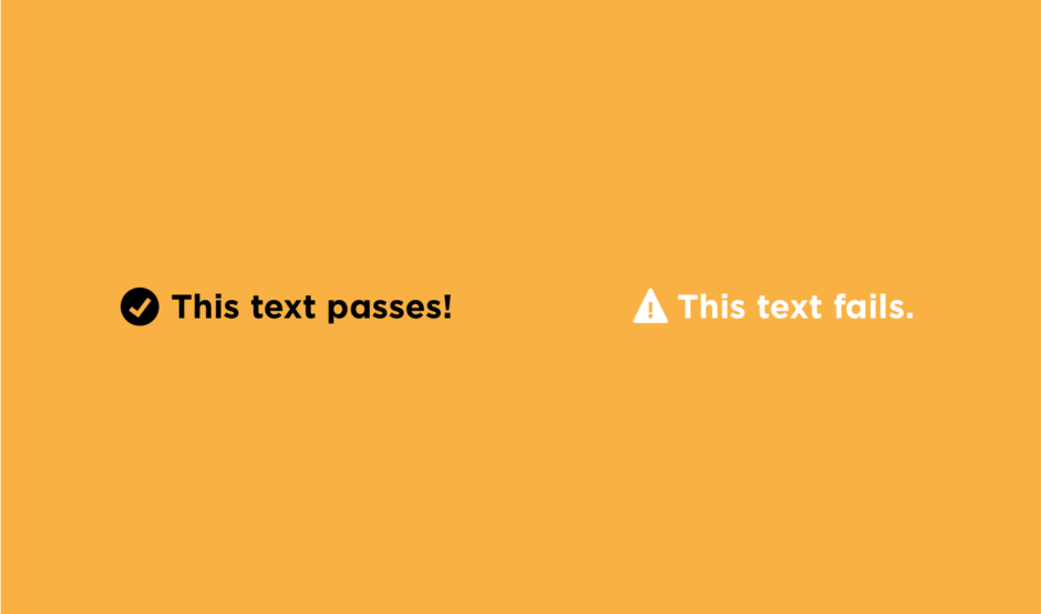
Don’t rely on the color-coding of your website to indicate when and where action needs to be taken. For an example, some websites that we see commonly use green check-marks to denote when something is “good” and red crosses when something is “bad”. Someone who is color blind wouldn’t know they were green or red, thus, wouldn’t understand the “good” or “bad” connection. We suggest using clear-cut wording on your call-to-actions to indicate what needs to be done, such as “click here!” on a button.
Image alt tags are not only great for SEO, but also great for those who may be blind or have trouble seeing things easily. Although a lot of people are influenced to write keywords within their image alt tag area for better SEO, it’s essential that you actually describe the contents of the photo here. If you have a picture of yourself holding your daughter eating an apple in the kitchen, you should write the alt tag as: “myself and my daughter in the kitchen eating apples together” or something similar. Try to avoid something like “eating apples”.
It’s so important that websites are accommodating to those with visual disabilities because if it isn’t, they may not even be able to interact with your website! If you are looking for a website design, we are currently booking for our last available spot in May. Book a discovery call with me to chat your project details and snag a timeline!